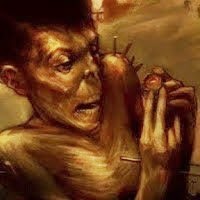
Inspired by the song "Four Fields" from the +/- album, a song I really dig...
I'm not really sure it is completely finished, may be I should add some background elements, I dunno, hope you'll help me guys!!
I would like to thank 3 friends, Mikael & Sat for suggesting me to do my shadows a little less black, and this guy for his constant support, advices and patience!!
and then, thank to all of you visitors for your nice comments!!!
take care.
ps: click on the image to see a better version...


24 commentaires:
La Force est avec lui ! Est-il l'Elu ?
Anders, first of all, thank you very much for your last comment in my personal blog: i appreciated your words. :)
Second, i love this last pic. For me is perfect. The background is great without some addition.
So, great colors and atmosphere. My best compliments.
Laura :)
Uau. Good work. Good style.
eh eh de rien ^^
-this guy ;) -
Ahlala, mais elle déboite cette illu...
et de rien pour les conseils, c'est vraiment le moins que je puisse faire...
Good stuff Anders! I like the composition, how the guy is leaning back a bit.
tres beau coloration! ;)
(great coloring)
I love it his expression, it says it all. Its looks like hes flinging some alien spore back at its mother as he is falling to his death but hes not even phased by it. Great work.
salut l('ami !
je pense que le crayonné marchait mieux ! tu aurais quasi pu faire figurer les deux !
bon courage avec ton mac hé hé hé
Excellent !!! pfff je ne sais plus quoi dire moi à force...... ^^;
Vi comme tu dis pas facile en plein soleil!! et j'adore l'attitude de ton gas hé hé il a la classss bis
Sweet stuff! That is a really cool expression. I like the palette on this again too.
Excellent Anders! Il me fait penser un peu a Matthew Bellamy de Muse! :)
uaaaau! great ilustration
saluditos por alli !
Hey Anders ! Where are you ?
J'te passe l'bonjour ^^
la bise :P
Hey ! What's next ?
You asked for some input and I'm one to give it when asked. First, I like this very much as is. Great face. It doesn't need a background unless you think you can communicate (my illustrator's brain talking) more with it but it should be very pushed back (soft contrast and focus) if you put something in. The splash-like thing in the air is a nice little mystery for the viewer and for the fellow in the painting.
The gesture helps tell the story here but I think I know how to improve it. Have the upper arm drop down some, make the folds in the shirt follow the arm. Then adjust the forearm so that it follows the direction of the hand. You'd have to do that anyway to have it connect to the upper arm. Before you do this I suggest doing a sketch of the full torso to get a sense of how everything works together. Don't forget that people's elbows usually come out a little when they lift their arms. I find it a lot easier to draw a full figure gesture drawing to get things right and then crop in. It seems like this guy might be sitting in a chair. If you think that I'm wrong on any of this feel free to tell me.
He Anders! On veut en voir plus!! :)
Salut a toi l'ami! J'espere que tout va bien!
good work
great paintings...well executed composition in the last few posts for sure...
merci monsieur Anders...arf je suis sure que tu sais faire ;)
Wow!
Excellent shadow and volume work brother!
Really like it!
( =_=)/
you are a colour master dude!
Vi c sur les panne d'ordi c la looze!!!par contre moi tout ce qui est photoshop et autre ..je n'y arrive pas du tout!!bzzzzzz
Ben ça tu vois (contrairement à Mishkin), j'ai pô encore vu !, et j'aime beaucoup le traité de cette illus !!
Bon, j'arrête d'envoyer des compliments à tout le monde, vous allez prendre la grosse tête, hé, hé, coquins que vous êtes ! :-))
Enregistrer un commentaire